티스토리 뷰
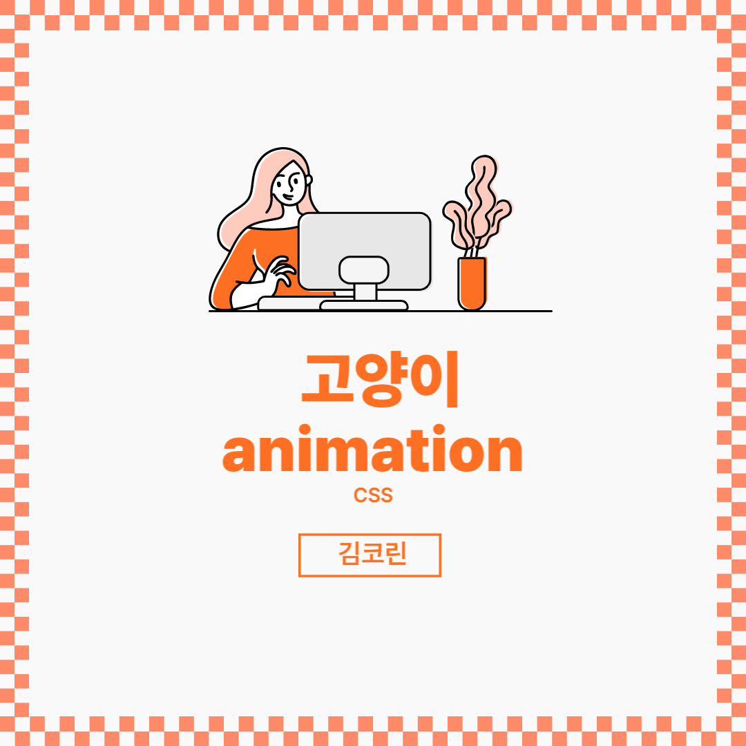
pug & Scss로 고양이 animation 만들기
pug & Scss 활용해보기
결과
pug
pug는 html을 조금 더 세련되게 쓸 수 있는 템플릿 언어, express 뷰 엔진이다. npm으로 설치할 수 있다.
<p> 라면에 밥 말아서 먹고 싶다 </p> 이렇게 쓰는 것을
p 라면에 밥 말아서 먹고 싶다 처럼 쓸 수 있다.
.cat
.ear.ear--left
.ear.ear--right
.face
    .eye.eye--left
    .eye-pupil
    .eye.eye--right
    .eye-pupil
    .muzzle
Scss
css보다 간단한 scss로 스타일을 주었다.
$color-black: #161616; //색 변수만들기
$color-white: #fff; //색 변수만들기
$size: 170px; // (Fully responsive)

// Cat
.cat {
    position: relative;
    height: $size;
    width: $size * 1.13;
}

// Ears
.ear {
    position: absolute;
    top: -30%;
    height: 60%;
    width: 25%;
    background: $color-white;

    // Ear hair
    &::before,
    &::after {
        content: '';
        position: absolute;
        bottom: 24%;
        height: 10%;
        width: 5%;
        border-radius: 50%;
        background: $color-black;
    }

    &::after {
        transform-origin: 50% 100%;
    }
}

.ear--left {
    left: -7%;
    border-radius: 70% 30% 0% 0% / 100% 100% 0% 0%;
    transform: rotate(-15deg);

    &::before,
    &::after {
        right: 10%;
    }

    &::after {
        transform: rotate(-45deg);  //눈알 움직임
    }
}

.ear--right {
    right: -7%;
    border-radius: 30% 70% 0% 0% / 100% 100% 0% 0%;
    transform: rotate(15deg);

    &::before,
    &::after {
        left: 10%;
    }

    &::after {
        transform: rotate(45deg); //눈알 움직임
    }
}

// Face
.face {
    position: absolute;
    height: 100%;
    width: 100%;
    background: $color-black;
    border-radius: 50%;
}

// Eyes
.eye {
    position: absolute;
    top: 35%;
    height: 30%;
    width: 31%;
    background: $color-white;
    border-radius: 50% 50% 50% 50% / 60% 60% 40% 40%;

    // Eyelids
    &::after {
        content: '';
        position: absolute;
        top: 0;
        left: 0;
        height: 0;
        width: 100%;
        border-radius: 0 0 50% 50% / 0 0 40% 40%;
        background: $color-black;
        animation: blink 4s infinite ease-in; //4초에 한번씩 눈깜빡임
    }

    @keyframes blink {
        0% { height: 0; }
        90% { height: 0; }
        92.5% { height: 100%; }
        95% { height: 0; }
        97.5% { height: 100%; }
        100% { height: 0; }
    }

    // Tips of the eyes
    &::before {
        content: '';
        position: absolute;
        top: 60%;
        height: 10%;
        width: 15%;
        background: $color-white;
        border-radius: 50%;
    }
}

.eye--left {
    left: 0;

    &::before {
        right: -5%;
    }
}

.eye--right {
    right: 0;

    &::before {
        left: -5%;
    }
}

// Pupils
.eye-pupil {
    position: absolute;
    top: 25%;
    height: 50%;
    width: 20%;
    background: $color-black;
    border-radius: 50%;
    animation: look-around 4s infinite;  //4초에 한번씩 눈알 굴림 x 무한

    @keyframes look-around {
        0% { transform: translate(0) }
        5% { transform: translate(50%, -25%) }
        10% { transform: translate(50%, -25%) }
        15% { transform: translate(-100%, -25%) }
        20% { transform: translate(-100%, -25%) }
        25% { transform: translate(0, 0) }
        100% { transform: translate(0, 0) }
    }

    .eye--left & {
        right: 30%;
    }

    .eye--right & {
        left: 30%;
    }

    // Glare on the pupil
    &::after {
        content: '';
        position: absolute;
        top: 30%;
        right: -5%;
        height: 20%;
        width: 35%;
        border-radius: 50%;
        background: $color-white;
    }
}

// Muzzle 코
.muzzle {
    position: absolute;
    top: 60%;
    left: 50%;
    height: 6%;
    width: 10%;
    background: $color-white;
    transform: translateX(-50%); //가로로 -50%만큼 이동
    border-radius: 50% 50% 50% 50% / 30% 30% 70% 70%;
}

/* General page styling */
html {
    height: 100%;
    display: flex;
    align-items: center;
    justify-content: center;
    background: $color-black;
}
'CSS' 카테고리의 다른 글
| 이미지 스프라이트(Image Sprite) | ir 효과 | 백그라운드 표현 (4) | 2022.08.20 |
|---|---|
| SCSS | SASS (3) | 2022.08.20 |
| 기본 문법 (2) | 2022.08.13 |
| 미디어쿼리(media query) (4) | 2022.08.13 |
| 벡터(Vector) | 비트맵(Bitmap) 차이 (11) | 2022.08.09 |
공지사항